
mostly Light Novels, but you could use this for typing other stuff.
This post is a Work in Progress.
But my blog looked blank, so I published it.
♦ How much have you typeset?
Not much.
♦ Do you do PDFs?
No, because way too many other people do. Besides, I like doing reflowable epubs more (because that's the format I always read in).
♦ What do you typeset in?
Adobe InDesign CC.
This may change after a few weeks, not sure yet.
♦ Why InDesign?
Of course, me being me, I'm more comfortable editing the code directly, but InDesign has made the tedious process of creating a table of contents and doing mundane styling things so much easier. Some people will feel more comfortable manually inserting <p> tags every single line. Some people don't format as much as I do. Some people like the GUI-oriented InDesign. It all depends on your tastes.
♦ Where do you get your full text documents from?
I copy and paste everything into Notepad, save with UTF-8 encoding, and import that into InDesign.
♦ Do I have to replace all those missing characters by hand?
No. This is actually the reason *cough* that I use InDesign now.
I use MingLiu for asian text. Make sure that in the epub file, MingLiu (or whatever asian font you pick) is included.
♦ Do you spellcheck?
No. All the places, names, and terms are generally all that show up.
♦Serif or Sans-serif?
Since I usually do reflowable epubs, my preference doesn't matter as much, but serif.
I find sans-serif to be more web style and less "print" style.
♦ How do you Furigana?
I don't. I search/replace all furigana with text<furigana>.
I don't like to have it as small text on top of the main text because I think it just makes it awkward to read.
If you really want to do it, here's some code:
There is always at least one point in your life where you just have to ignore Butterwick's Practical Typography.
Yes, I know. I disregard it all the time. (Using Arial, how scandalous).
Anyways, I just turn on the small-caps option, therefore faking the small caps, because of font compatibility and stuff.
♦ What the heck is a drop cap?
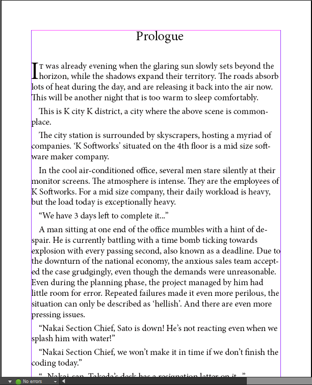
That. If the light novel you're typesetting doesn't contain any one-line first paragraphs (read: rare), go ahead. (Which is why you don't see it too often from me).
♦ Ellipses?
There is a special ellipsis character that you should be using. For reference, I'll leave it here {…}
(Yes, that is one character). Also according to grammar, no spaces between ellipses and text. (Unless the word is being repeated, like... like this.)
♦ Fonts?
For epubs: No. I'll advise you to not lock anything to a specific font.
except certain unicode and/or Asian characters that require it for proper rendering.
You're completely ruining one of the *main* points of epubs,
For PDFs: I haven't made a PDF yet, so I wouldn't know. I'll get back to you when I do.
Edit: 1/1/2017
♦ Always make 100% sure that the first page of a chapter is on the right side when doing a pdf. This helps with readability. Things like Arc separator pages should also be their own right-side page
This post is a Work in Progress.
But my blog looked blank, so I published it.
♦ How much have you typeset?
Not much.
♦ Do you do PDFs?
No, because way too many other people do. Besides, I like doing reflowable epubs more (because that's the format I always read in).
♦ What do you typeset in?
Adobe InDesign CC.
This may change after a few weeks, not sure yet.
♦ Why InDesign?
Of course, me being me, I'm more comfortable editing the code directly, but InDesign has made the tedious process of creating a table of contents and doing mundane styling things so much easier. Some people will feel more comfortable manually inserting <p> tags every single line. Some people don't format as much as I do. Some people like the GUI-oriented InDesign. It all depends on your tastes.
♦ Where do you get your full text documents from?
I copy and paste everything into Notepad, save with UTF-8 encoding, and import that into InDesign.
♦ Do I have to replace all those missing characters by hand?
No. This is actually the reason *cough* that I use InDesign now.
I use MingLiu for asian text. Make sure that in the epub file, MingLiu (or whatever asian font you pick) is included.
♦ Do you spellcheck?
No. All the places, names, and terms are generally all that show up.
STYLING STUFF THAT YOU CAN IGNORE
Because most of these are just personal preferences, really.
♦Serif or Sans-serif?
Since I usually do reflowable epubs, my preference doesn't matter as much, but serif.
I find sans-serif to be more web style and less "print" style.
♦ How do you Furigana?
I don't. I search/replace all furigana with text<furigana>.
I don't like to have it as small text on top of the main text because I think it just makes it awkward to read.
If you really want to do it, here's some code:
<span style="white-space: nowrap; position: relative;"><span style="position: absolute; font-size: .8em; top: -11px; left: 50%; white-space: nowrap; letter-spacing: normal; color: inherit; font-weight: inherit; font-style: inherit;"><span style="position: relative; left: -50%;">furigana</span></span><span style="display: inline-block; color: inherit; letter-spacing: normal; font-size: 1.0em; font-weight: inherit;">normal text</span></span>
There is always at least one point in your life where you just have to ignore Butterwick's Practical Typography.
Yes, I know. I disregard it all the time. (Using Arial, how scandalous).
Anyways, I just turn on the small-caps option, therefore faking the small caps, because of font compatibility and stuff.
♦ What the heck is a drop cap?
♦ Ellipses?
There is a special ellipsis character that you should be using. For reference, I'll leave it here {…}
(Yes, that is one character). Also according to grammar, no spaces between ellipses and text. (Unless the word is being repeated, like... like this.)
♦ Fonts?
For epubs: No. I'll advise you to not lock anything to a specific font.
except certain unicode and/or Asian characters that require it for proper rendering.
You're completely ruining one of the *main* points of epubs,
For PDFs: I haven't made a PDF yet, so I wouldn't know. I'll get back to you when I do.
Edit: 1/1/2017
♦ Always make 100% sure that the first page of a chapter is on the right side when doing a pdf. This helps with readability. Things like Arc separator pages should also be their own right-side page
Comments
Post a Comment
Hi! Please be nice, but do let me know if I made any errors and I'll correct them asap!